Brunch Haus Rebrand Project
Brunch Haus is a beloved local restaurant in Jacksonville Beach, known for its welcoming atmosphere, fresh ingredients, and dedication to the community. The original branding felt outdated and lacked the cohesion needed to capture its vibrant, beachside charm. My goal was to create a bold, modern identity that reflects Brunch Haus’ energetic and friendly spirit while staying true to its local roots.
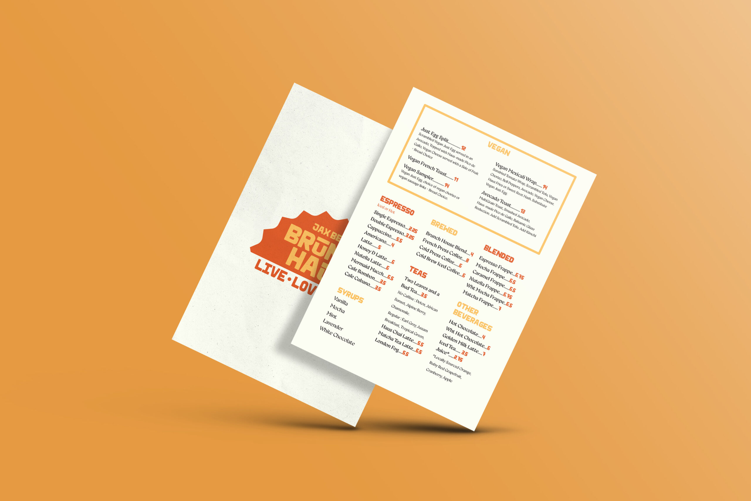
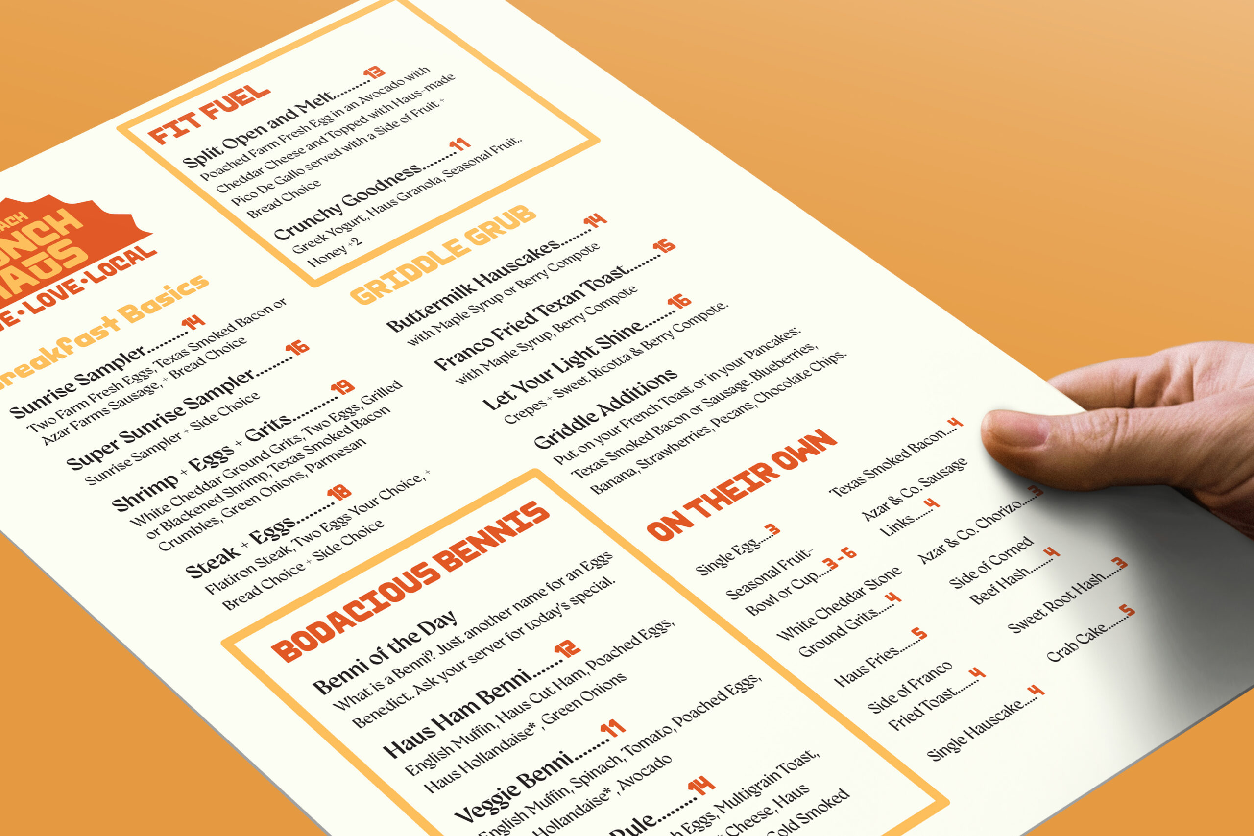
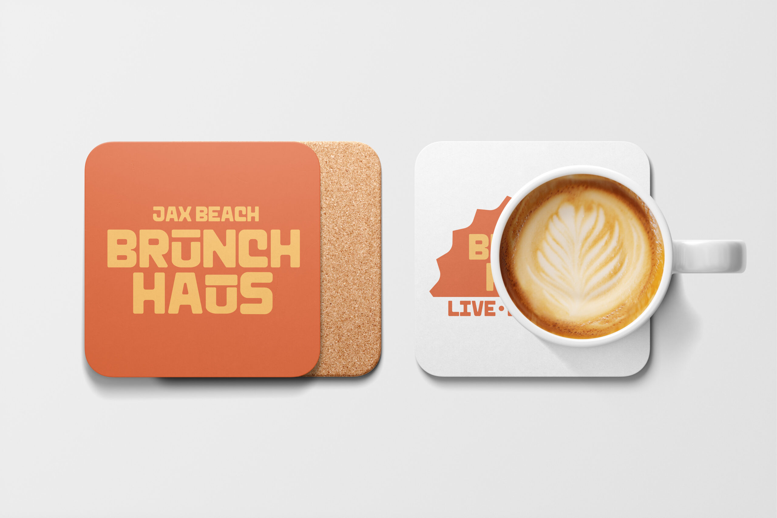
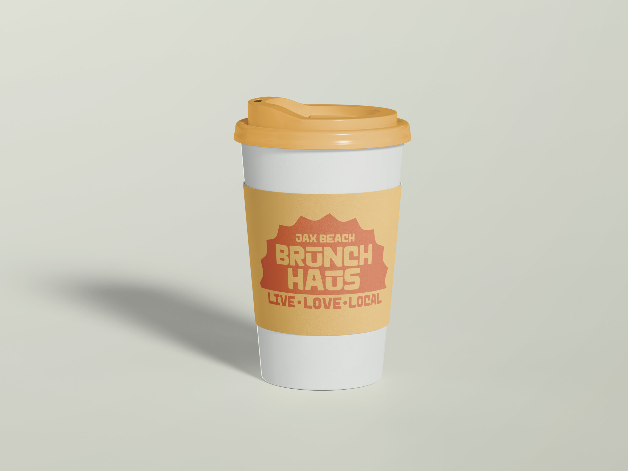
The new logo takes inspiration from vintage diner signage and the warmth of a beach sunrise, combining playful typography with a strong, recognizable shape. The jagged outline hints at the texture of a cracked egg—an homage to breakfast—while resembling the rising sun, symbolizing a fresh start to the day.

The Challenges
The original Brunch Haus branding lacked a cohesive identity, making it difficult to stand out in Jacksonville Beach’s competitive brunch scene. The previous logo featured hand-lettered typography that felt inconsistent and didn’t fully capture the restaurant’s personality. Additionally, there was no strong visual connection to the beachside location or the warm, inviting nature of the brand.
Solution
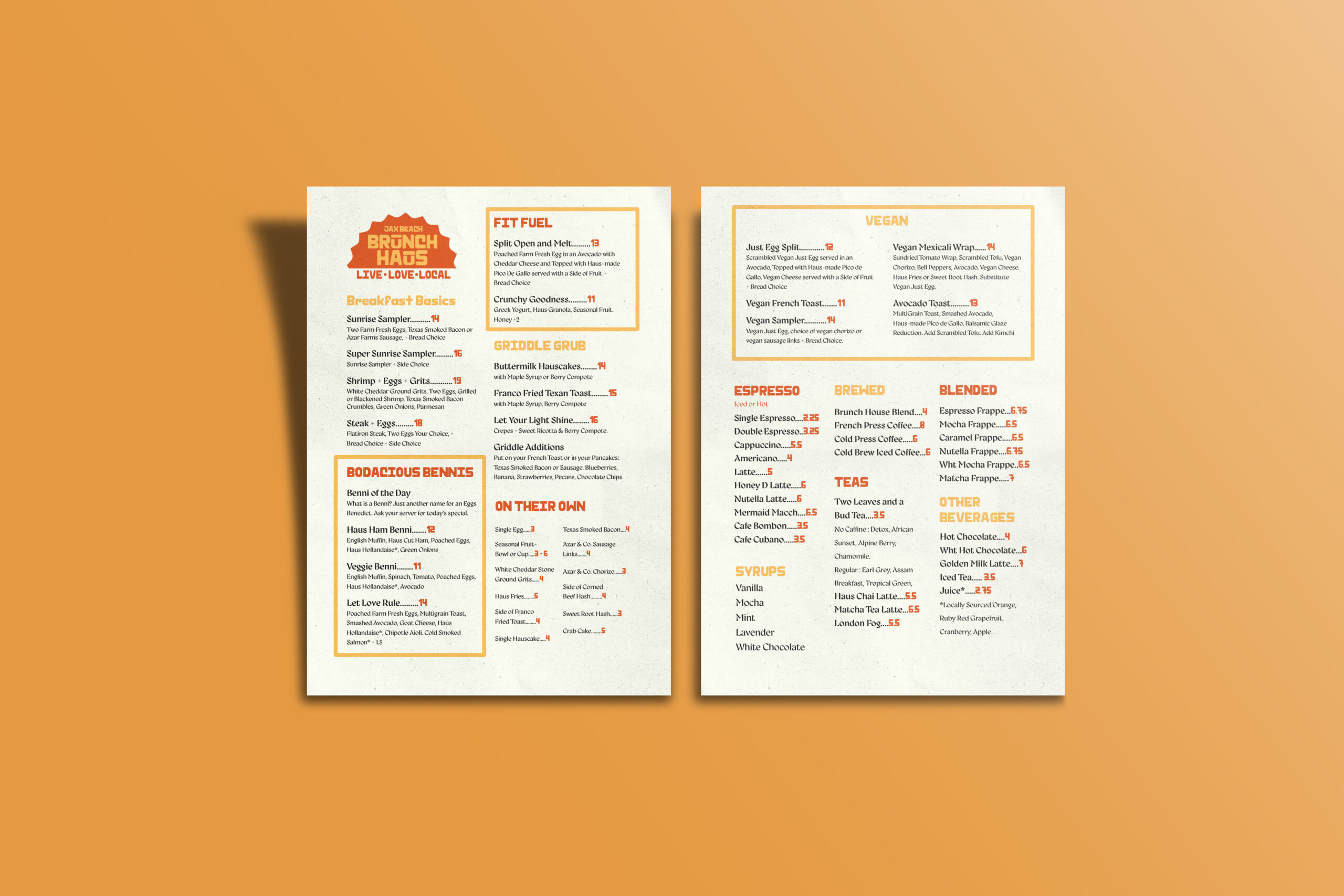
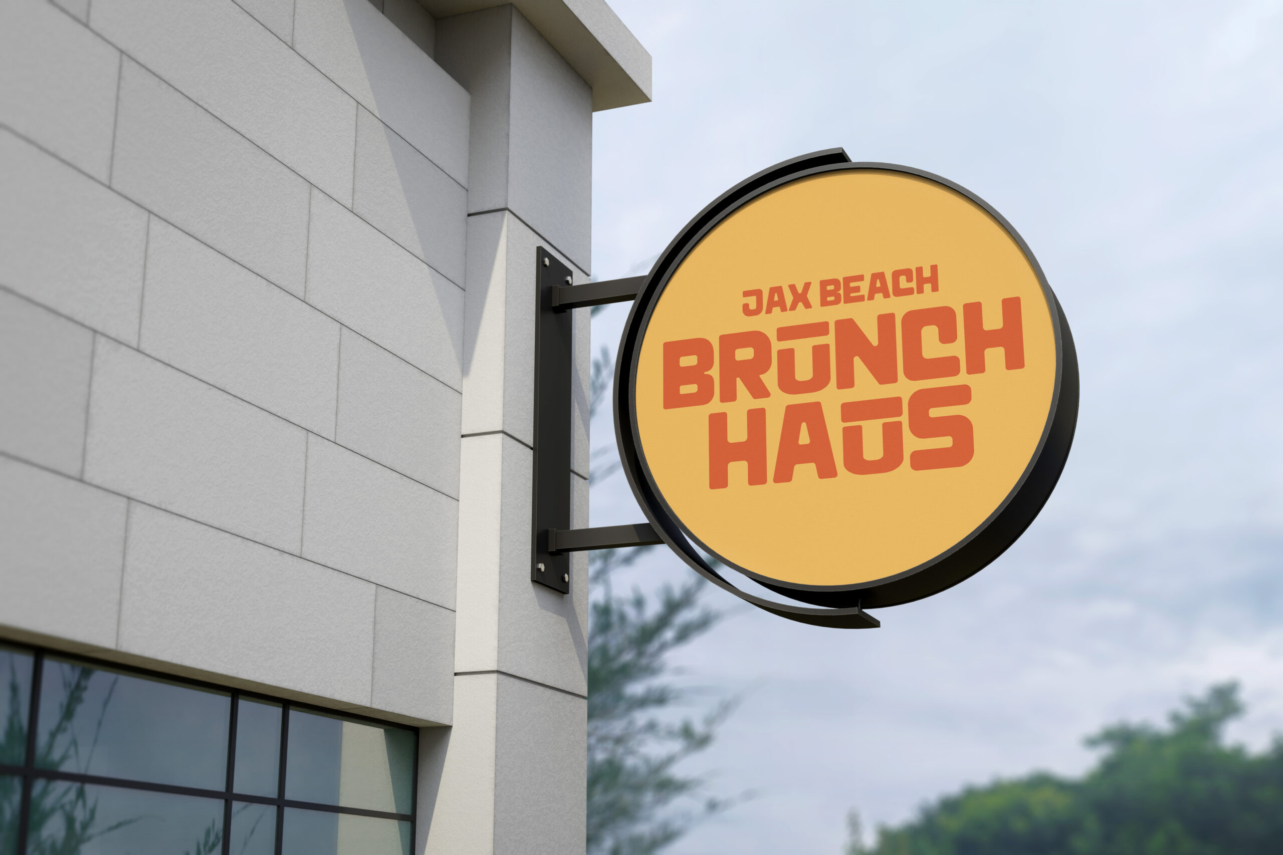
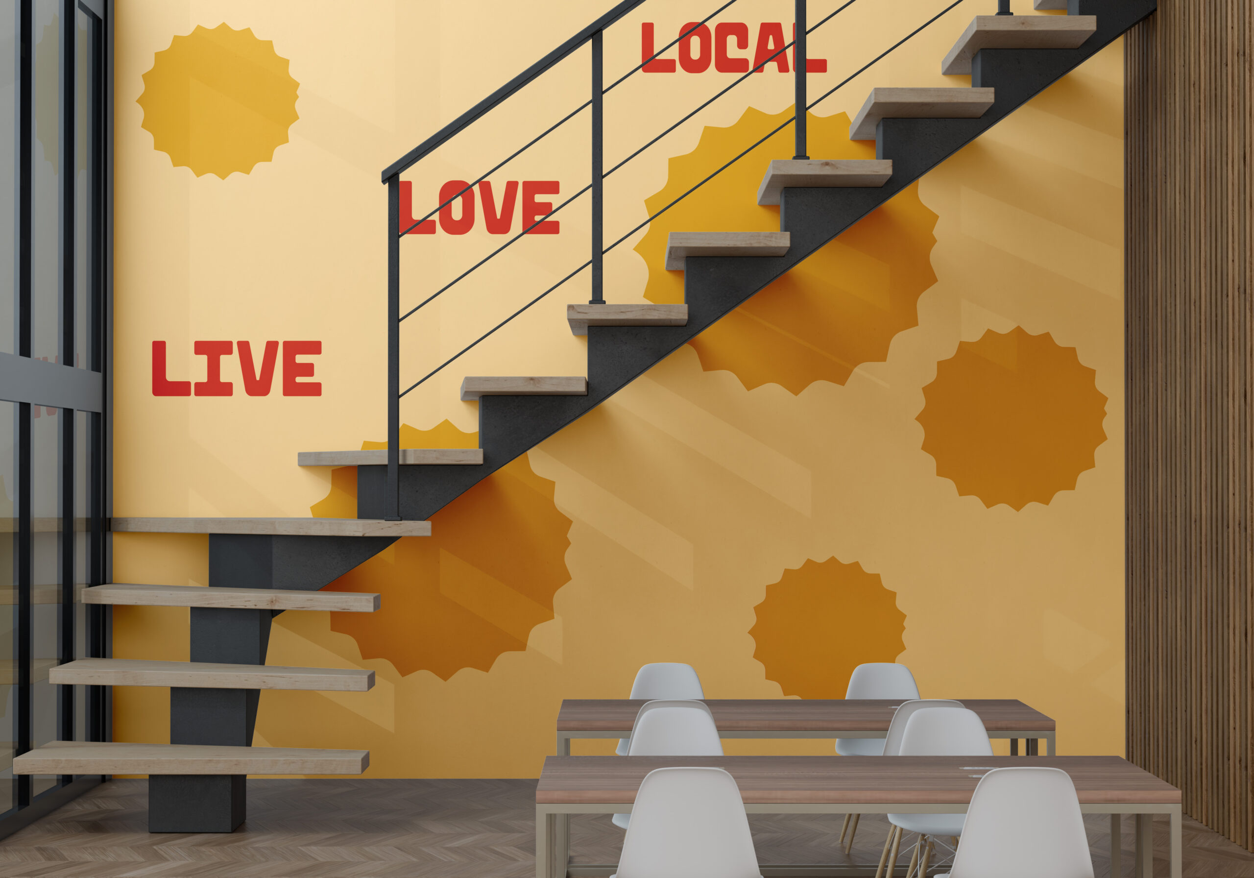
To address these challenges, I developed a bold, modern identity that balances playfulness with a professional, polished look. I introduced a structured yet friendly typeface that maintains the warmth of hand-lettering while enhancing legibility and brand consistency. The sunburst-inspired shape brings energy and movement, reinforcing the idea of starting the day at Brunch Haus. The refined color palette of warm oranges and yellows connects to the food and the local beachside culture, creating a strong emotional tie to the community.
This redesign transformed Brunch Haus into a visually compelling and memorable brand, ensuring it resonates with locals and tourists looking for a vibrant brunch spot.
More Work

